Monthly Postcard Club
Juin 2026
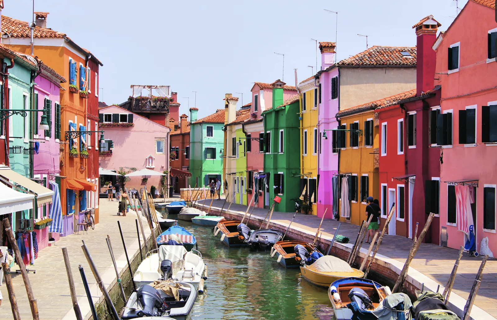
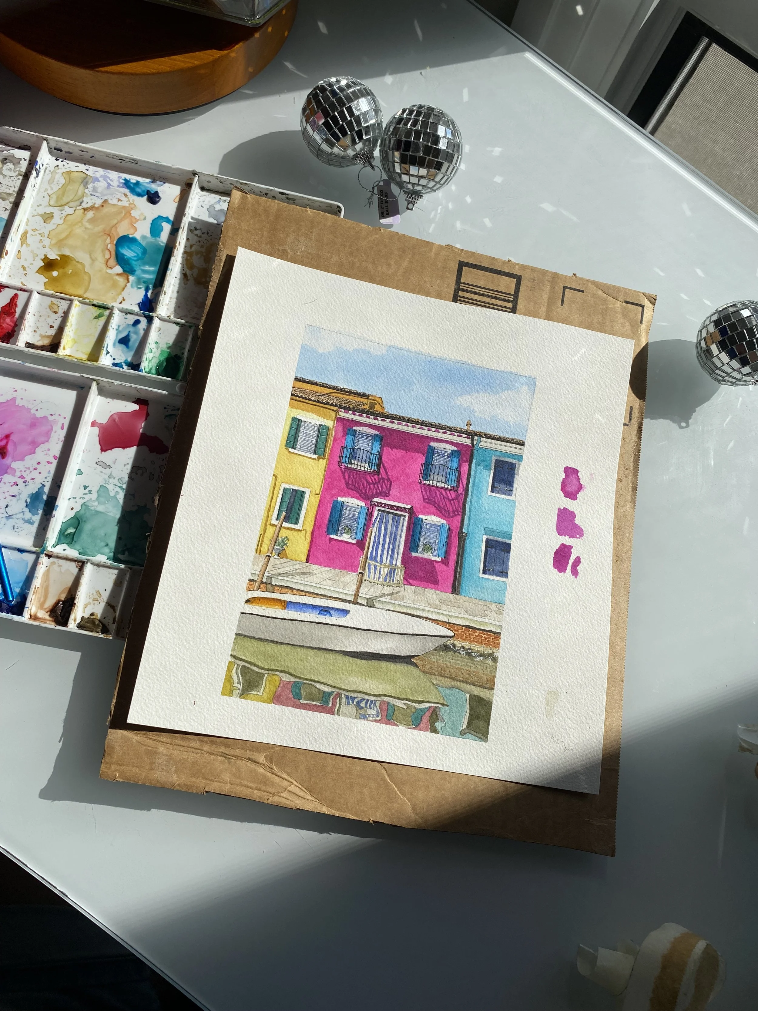
Burano, Italy
Happy Solstice!
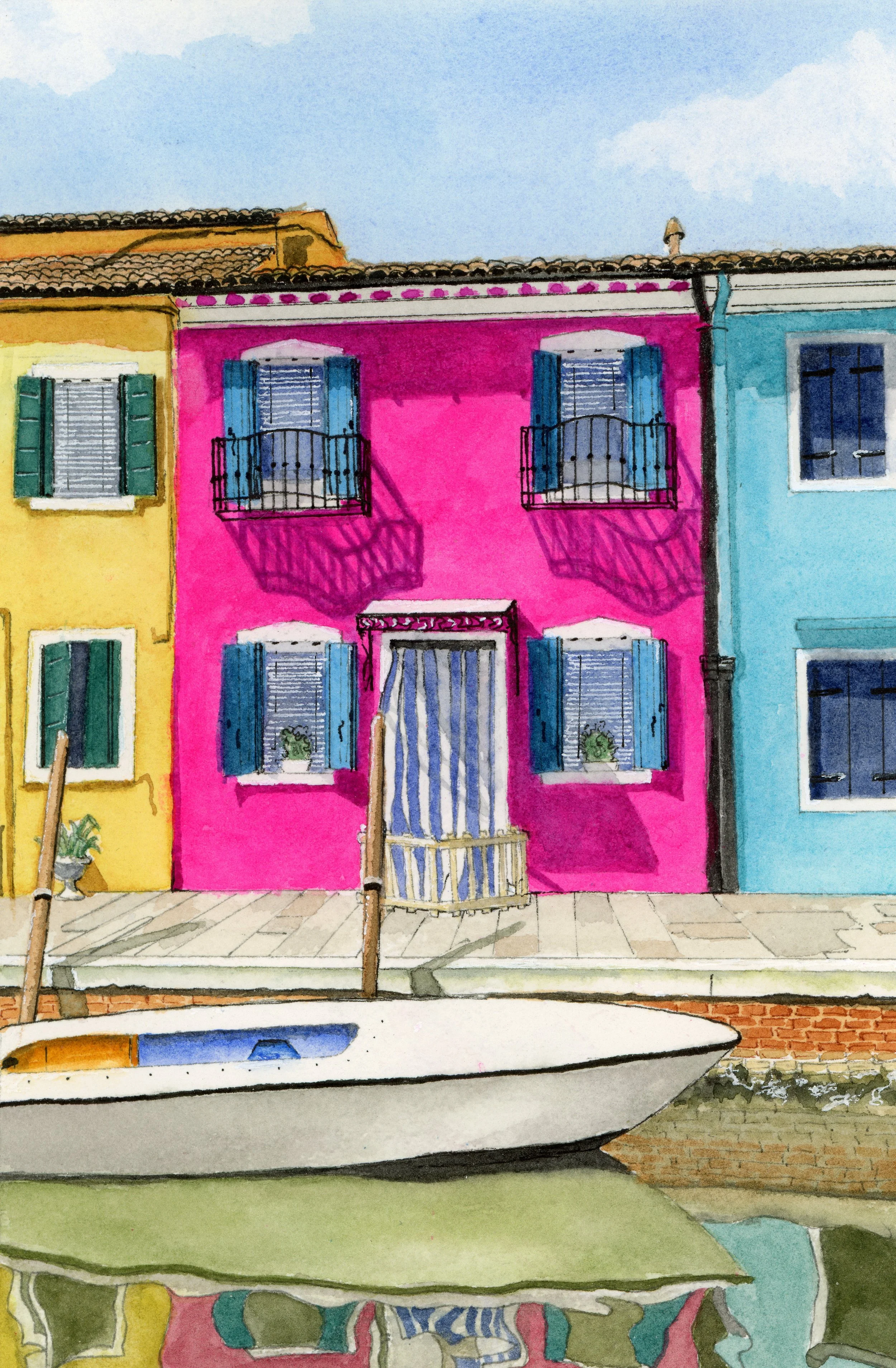
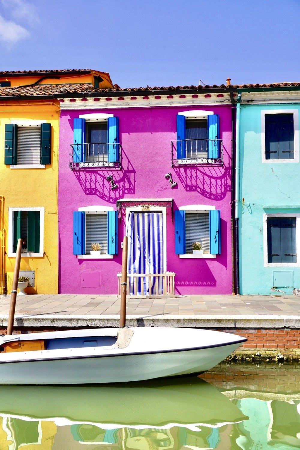
We’re back in Burano, Italy! A fishing village just outside of Venice that feels too vibrant to be real.
Read last month’s post to learn more about its history and why I painted these homes —> May 2026 Postcard Club Blog
Learn More: Re-thinkingTheFuture.com/Architects-Lounge
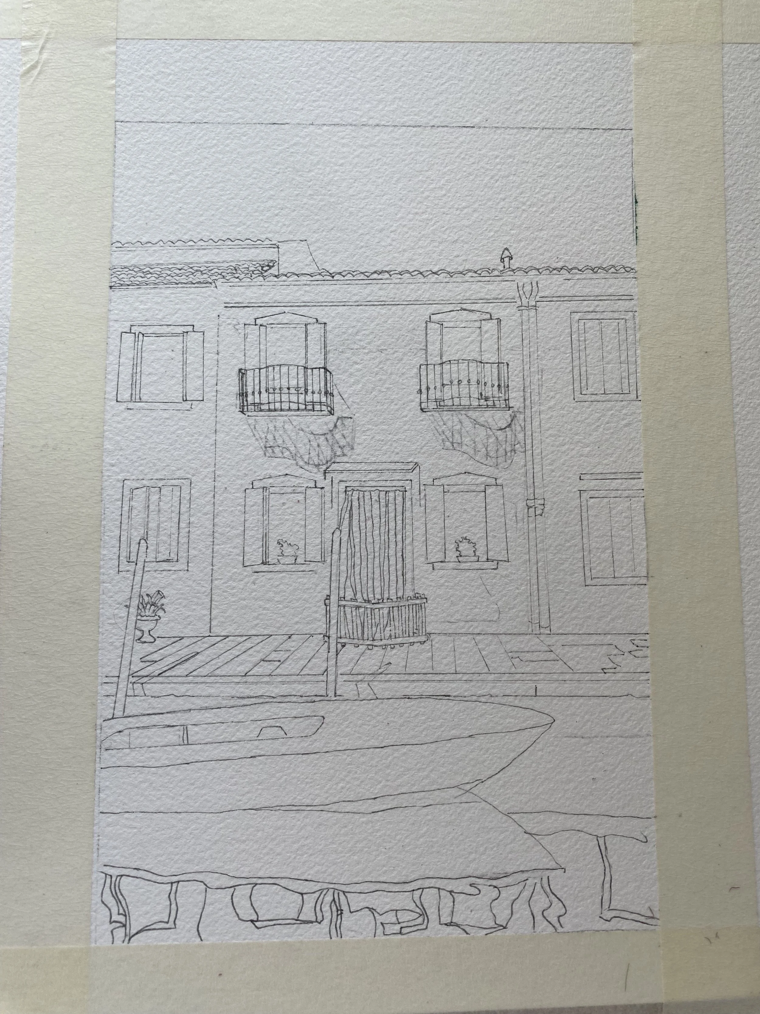
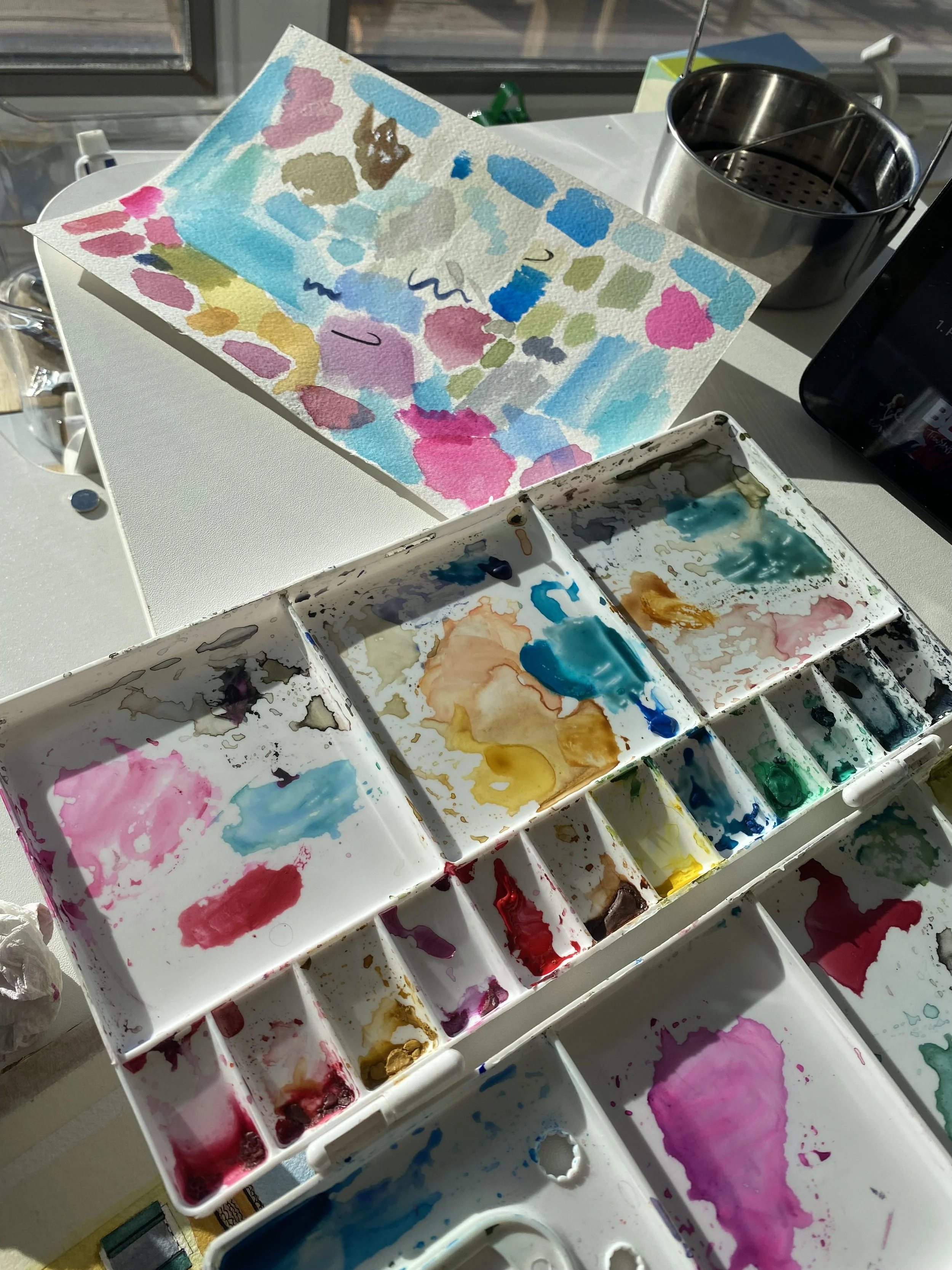
In 2024, painting colorful waterfront architecture and boats were firsts for me. As I study the time lapse videos in which I capture my painting process for the purpose of the blog, I realize that I would now take a very different approach.
Common mistakes were made in my opinion: I (1)overworked the paper which happened because I (2) use pigment that was too opaque.
Overworking the paper
When you overwork the cotton paper the colors lose luminosity and look very chalky. Watercolor relies on light reflecting through transparent layers. Scrubbing and repeatedly brushing an area damages the paper surface and disturbs previous layers. You can see the strokes eventually and you can tell that I went over and over it.
Now I would place the wash confidently and leave it alone, let areas dry completely before reworking and MOST IMPORTANTLY accept a few blooms and backruns, because this is the beauty of watercolor.
Opaque Pigment
I was repeat offender of overworking the sensitive paper because the washes dried so much lighter than I anticipated. Be aware that certain pigments are naturally more opaque:
Cadmium colors
Cerulean Blue
Naples Yellow
Some greens
I would now build paintings primarily with transparent or semi-transparent pigments and use opaque pigments intentionally. I think its really important to test your washes and let those dry completely to see if you get the result that you want. Then, before you apply the wash make sure that you create enough of the wash on your palette to cover the whole space - so that half way through you are not stopping to mix more, allowing one small section to dry. This will result in unintentional lines and strokes in an area that you would want to be smooth.
As An FYI : Student-Grade Paints versus Professional Paints
Student paints often contain less pigment and more filler.
I typically work with professional-grade Winsor & Newton paints, which have excellent pigment strength. You may notice that you struggle with vibrancy simply because your paints might not don't release as much pigment. My suggestion is a little less water. And remember TEST your washes on a scrap of paper.
A useful rule:
White paper + confident darks + limited pigment mixtures + intentional areas of saturation = vibrant watercolor paintings.
Many painters try to create vibrancy by adding more color. In watercolor, vibrancy is often created by preserving light and being selective about where the strongest color lives.
Always feel free to reach out to me with questions!!
Amities,
Jacqueline